Monday, May 12, 2014

Jeans Visual Merchandising display

Today was the jean display practice. The stuff that I brought include jeans long pants, jeans short pants, belt, bag, book, jacket,jeans clothes and hanger. The color of the display from dark to light. 


the first visual that I had done
                                       
Next, it's to be change the second visual. 


                                                  The second visual on the land. 
Change the new place with the new style


The thing that I had learnt today, jeans display could be involve everything. The important is the effect of color. Color must be match with entire display.
Balance of color can be: 90%  -  10%
                                         80%  -  20%
                                         70% - 30%
This percentage of the color is easier for us matching entire display. 

Sunday, May 11, 2014

Element design of visual merchandising

Element of Design - LINE
 A line can be thought of as points so close together that they lose their individual identity and form a new entity
                                                                                                                                        Since lines can be straight, curved, or irregularly shaped, you can also think of a line as the track of a point in motion. 
 Vertical lines can stop eye movement
They also equate to power and strength. 

Horizontal lines symbolize rest and relaxation 
Diagonal lines are dynamic and action-oriented. 

Lines, like points, can direct attention to a specific location in a visual image


Thick lines are more powerful than thin lines.


Lines allow you to quickly visualize an object or idea with a minimum of time and material.
By emphasizing basic structure, objects depicted through line drawings are easy to recognize and can be effective for learning

 Element of design – Shape

A shape is defined as an area that stands out from the space next to or around it due to a defined or implied boundary, or because of differences of value, color, or texture. 

A shape is formed when a line encloses an area.

Shapes can vary endlessly and can suggest physical form and direct eye movement.

Simple shapes are remembered and understood more easily than complex shapes
Element of Motion
Movement in a visual image comes from the kinds of shapes, forms, lines, and curves that are used.

Motion or movement in a visual image occurs when objects seem to be moving in a visual image.

Diagonal lines tend to create the illusion of movement or motion.
 Element of design - Texture
Definition
Texture is defined as the surface characteristics of a material that can be experienced through the sense of touch or the illusion of touch.
In visual images, actual textures can be used, such as cloth, boxes, small objects, and natural items.
This billboard in Indianapolis, Indiana, is made of discarded materials normally found in a junkyard. 

Texture can be used to accent an area so that it becomes more dominant than another


Saturday, May 10, 2014

Principle of design

Principles of design - Balance
Balance - is a feeling of visual equality in shape, form, value, color, etc.  Balance can be symmetrical or evenly balanced or asymmetrical and un-evenly balanced.  Objects, values, colors, textures, shapes, forms, etc., can be used in creating a balance in a composition
In visual images, balance is formal when both sides are symmetrical in terms of 
arrangement. 
              
Example of principle design formal balance display photo.
Informal balance is more dynamic than formal balance and normally keeps the learner's attention focused on the visual message. 
Example of principle design informal balance (Asymmetrica) display photo.


There are three main types of balance
vertical balance

horizontal balance

radial balance

Design Principles - Harmony

 Patterns or shapes can help achieve harmony.
By repeating patterns in an interesting arrangement, the overall visual image comes together.
Harmony pulls the pieces of a visual image together. 

Harmony can be achieved through repetition and rhythm.
Repetition reemphasizes visual units, connecting parts and creating an area of attention

Harmony in visual design means all parts of the visual image relate to and complement each other

 Design Principles - Proportion
Proportion refers to the relative size and scale of the various elements in a design. The issue is the relationship between objects, or parts, of a whole. This means that it is necessary to discuss proportion in terms of the context or standard used to determine proportions.


Example of proportion design


Example of proportion design photo.

Design Principles - Rhythm 
Rhythm is the repetition or alternation of elements, often with defined intervals between them.
Rhythm can create a sense of movement, and can establish pattern and texture. There are many
different kinds of rhythm, often defined by the feeling something evokes when viewed.
Rhythm can be thought of as a pattern in movement. You can hear it in varied sounds to create music or in the steady drip of a faucet. It can also be seen; think about lines in the sidewalk and how your footsteps relate to the regular breaks. Rhythm can be seen and heard throughout nature and in our built environment through repetition, alternation and progression. These three methods of achieving rhythm can be applied to interior spaces as a way to introduce order, interest and focus, and to help lead your eye through a room.


Example of principle design rhythm photo.


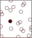
Design Principles - Emphasis
Emphasis is an area that first attracts attention in a composition. This area is more important when compared to the other objects or elements in a composition.  This can be by contrast of values, more colors, and placement in the format.


Emphasis as a focus point. In the photo, is our eye focus on brown color when look at it.